
Pantone Color of the Year – Ready to Take The Plunge?
The word is out – and that word is “coral”
“Living Coral,” to be more precise. Pantone has just announced it’s 2019 Color of the Year, and that’s what it is called. Living Coral.
“So what?” you may ask.
Well, what it means is that this color will be quite visible everywhere you look – it’s already been adopted into clothing worn by noted celebrities such as Megan Markel, Kate Middleton and Chrissy Teigen. It will also influence interior design, new website designs, new magazine layouts, new graphic design in general to name a few examples.
Pantone’s Color of the Year, whatever you may think of it, does have impact on the design world.
What are they saying about this color? Pantone calls it lively yet soothing. One thing it definitely isn’t is boring. It seems that this year is going to be even more “lively” than we’re used to. Compare it to the last year’s relatively calm Color of the Year, UltraViolet.
How can you use it? Consider starting off with a temporary piece that makes a bold statement. If you run a retail shop, a banner display or a removable vinyl window graphic. In the home, maybe create your own abstract design and have it printed and framed. Live with it for a couple of weeks.
Love it? Great, then go ahead full steam. Make your whole world living coral. Not loving it so much? Then you haven’t invested too much and can easily steer toward something more suited to you. Or just wait for next year’s color!
Among the other trends of 2019 predicted for websites and graphic design in general are: Metallic elements, liquid elements, abstract art and “anti-gravity” elements. It almost seems like ’60s psychedelia meets ’80s retro-chrome. One thing is certain – graphic designers are going to be like kids at Christmas where there is always another gift under the tree to open.
So, get ready – Living Coral is coming your way in just a few weeks. Snorkels, anyone?
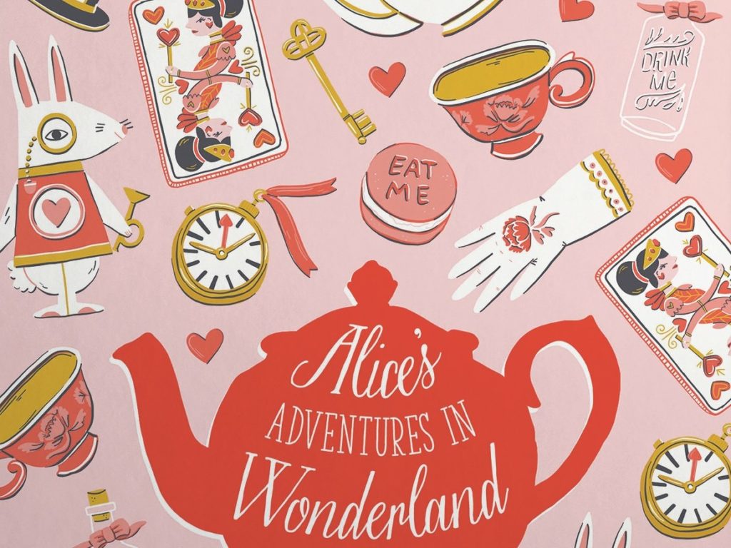
Playful Alice-in-Wonderland graphic would make a fun wall mural for a young girl’s playroom, or an evocative framed image for a vanity. image from DesignModo 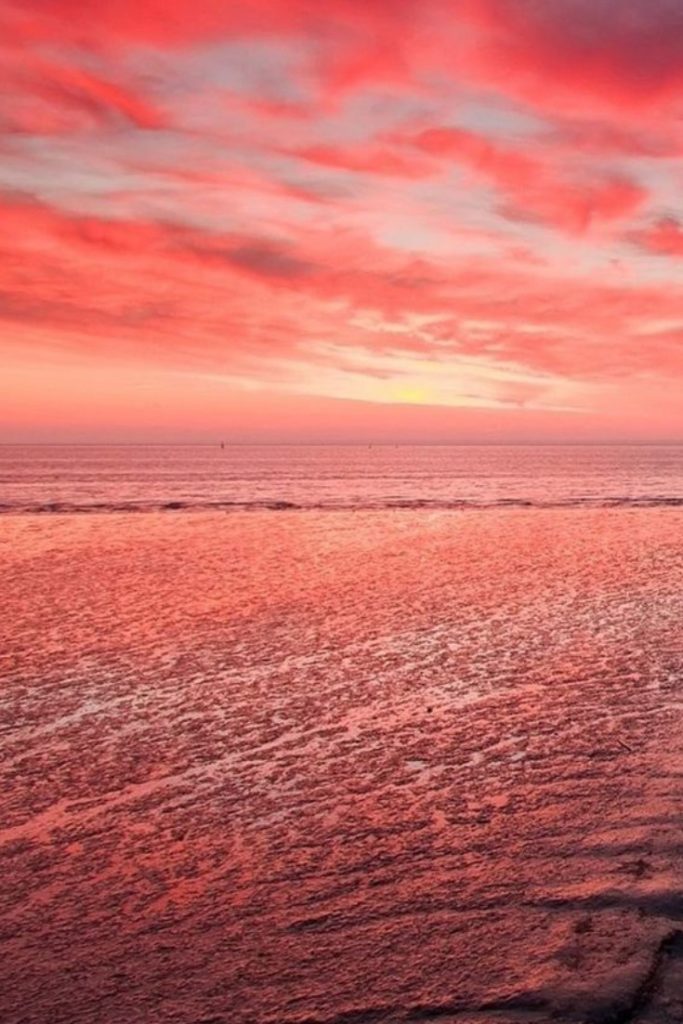
This unique spin on a beach theme would add a warm tone as a wall mural in a bedroom, or a great banner for a retail store. 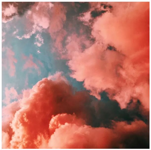
This striking cloudscape would make an eye-catching wall mural – or even a ceiling mural! image from EvolveEvents
Imagine this inviting graphic in your retail display window – welcoming the new year AND your in-the-know fashion-conscious customers.
Scantech Graphics, located in the Kearny Mesa neighborhood of San Diego, has what you need to make it all happen.