What do you do with an old Post Office?
Problem
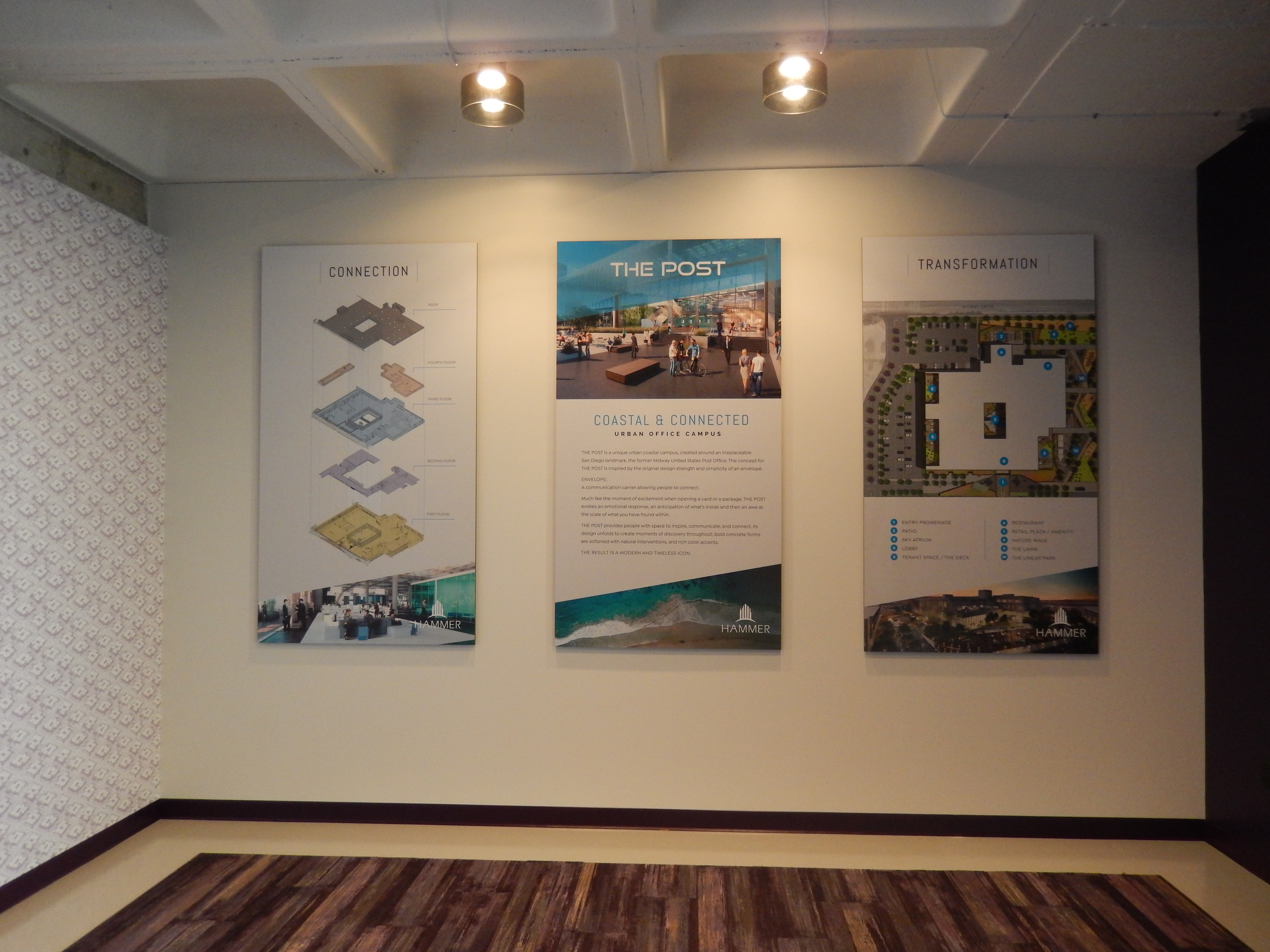
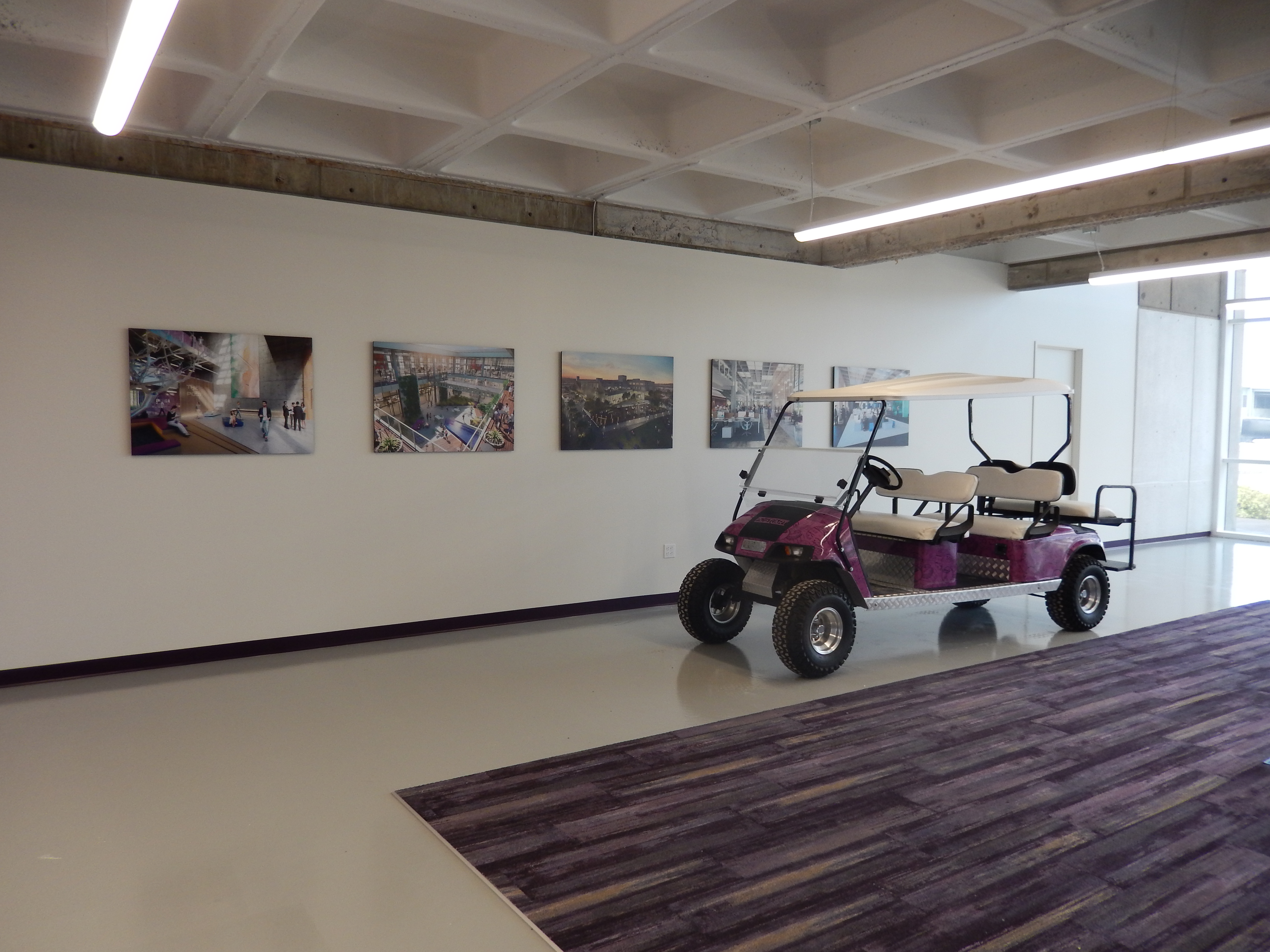
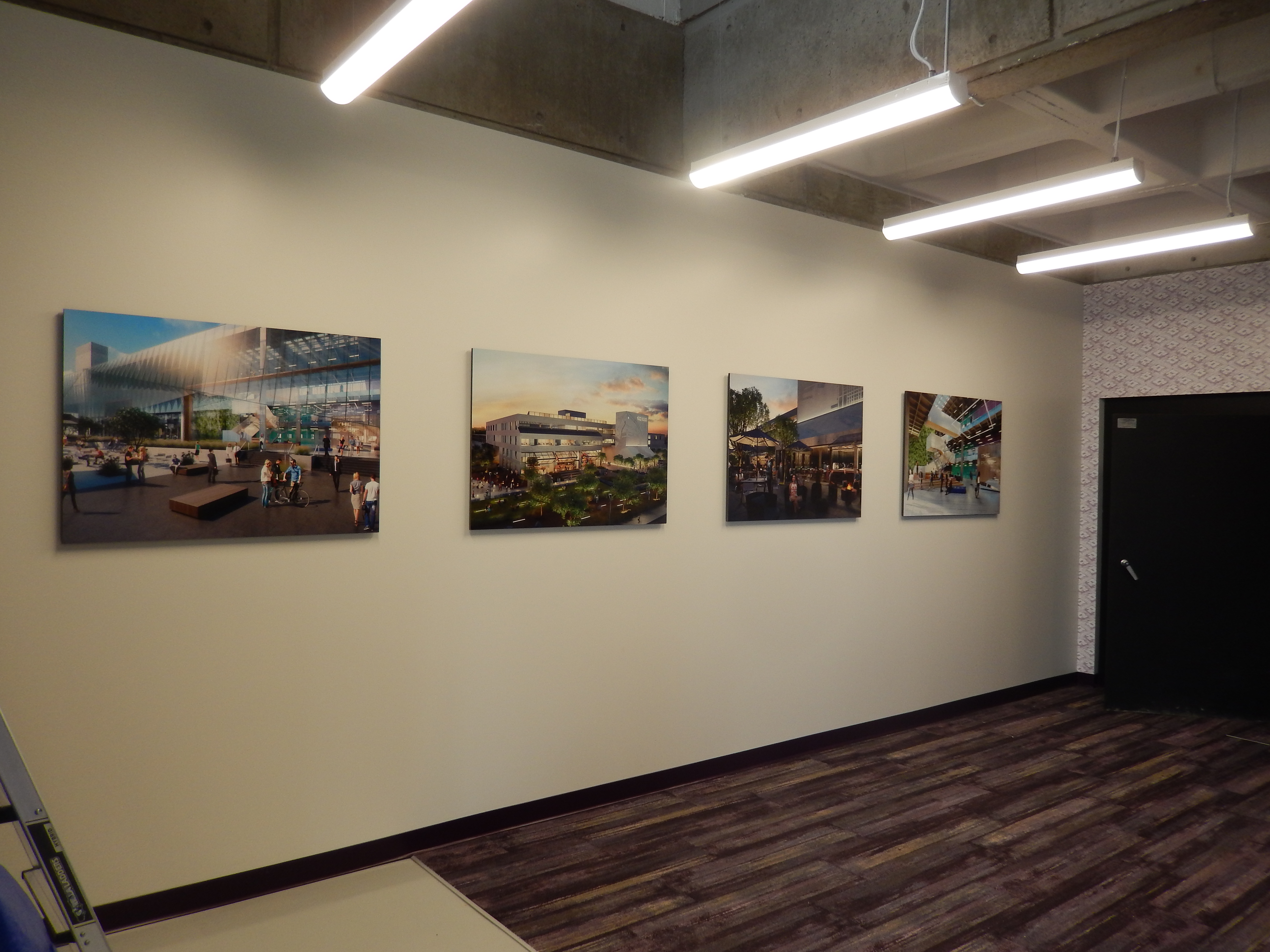
Provide an overall seamless branding through wall mural, museum-mounted photographic panels, and vehicle wrap for sales office of a new development which will use a golf cart to give tours of the site.
Solution
LPA Architects (www.lpainc.com) contacted us to assist in fulfilling the goals of their client, Hammer Ventures, which has proposed a dramatic new use for an old post office in San Diego.
The old U.S. Post Office located on Midway is a unique building with what was a very modern design when it opened. The post office retired the building when San Diego outgrew its use and it has been on the market for some time. Hammer Ventures stepped up to the challenge and came up with a renovation that includes opening up interior spaces to sunlight, marrying business spaces with residential units, a coffee shop/restaurant and dramatic landscaping.
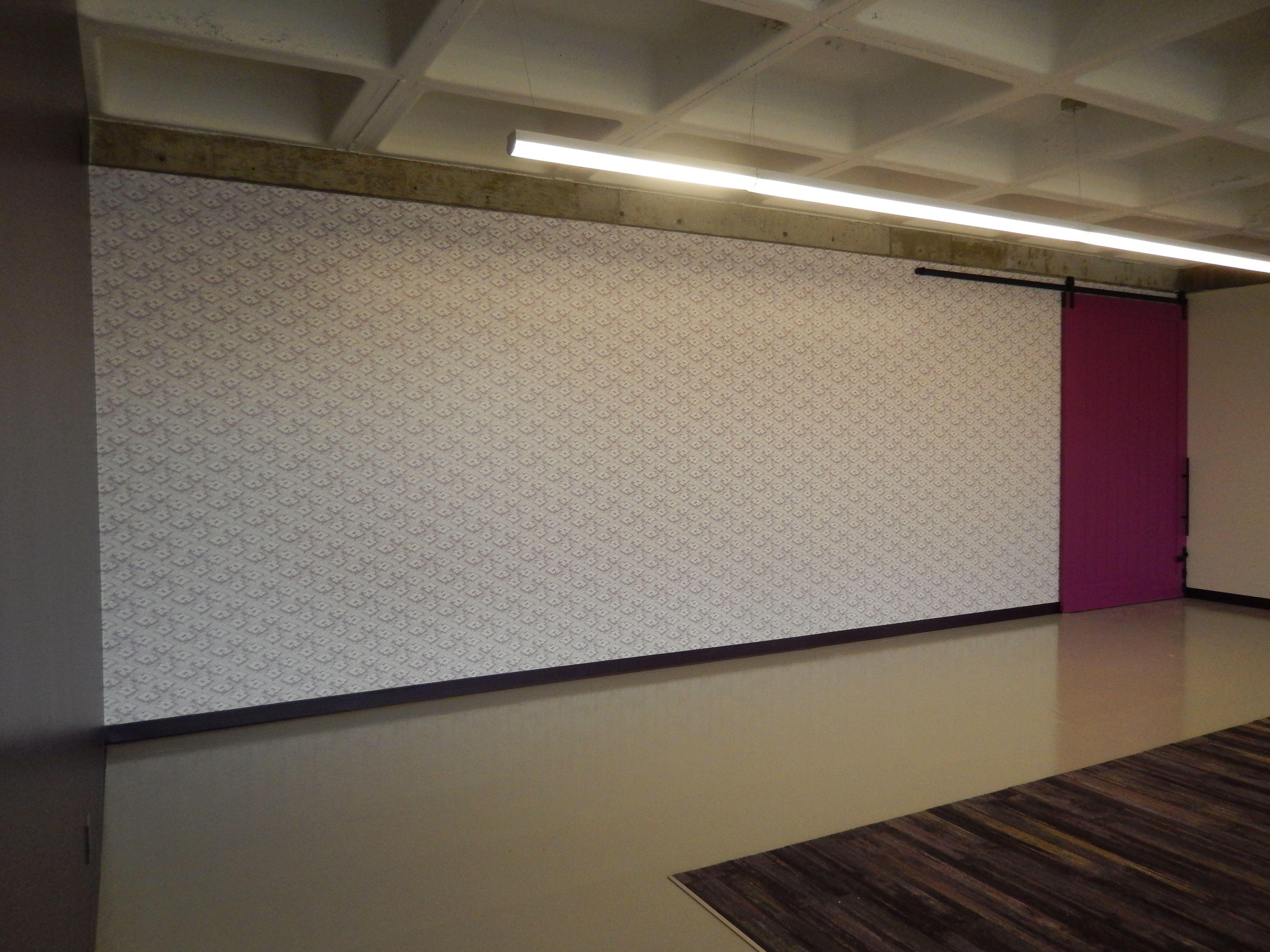
Our Design Department worked closely with the client’s designer. They came up with a repeating stylized wire-frame sketch of the property’s proposed development, and we were able to create a seamless wall mural 12’ high x 65’ wide. Rick Burrett Design, a graphics and branding professional we have enjoyed working with before, provided the final wire frame artwork and high resolution renderings of the proposed development.
Working within the budget Hammer Ventures had outlined, we were able to produce large format art giving potential buyers a vivid preview of the development.
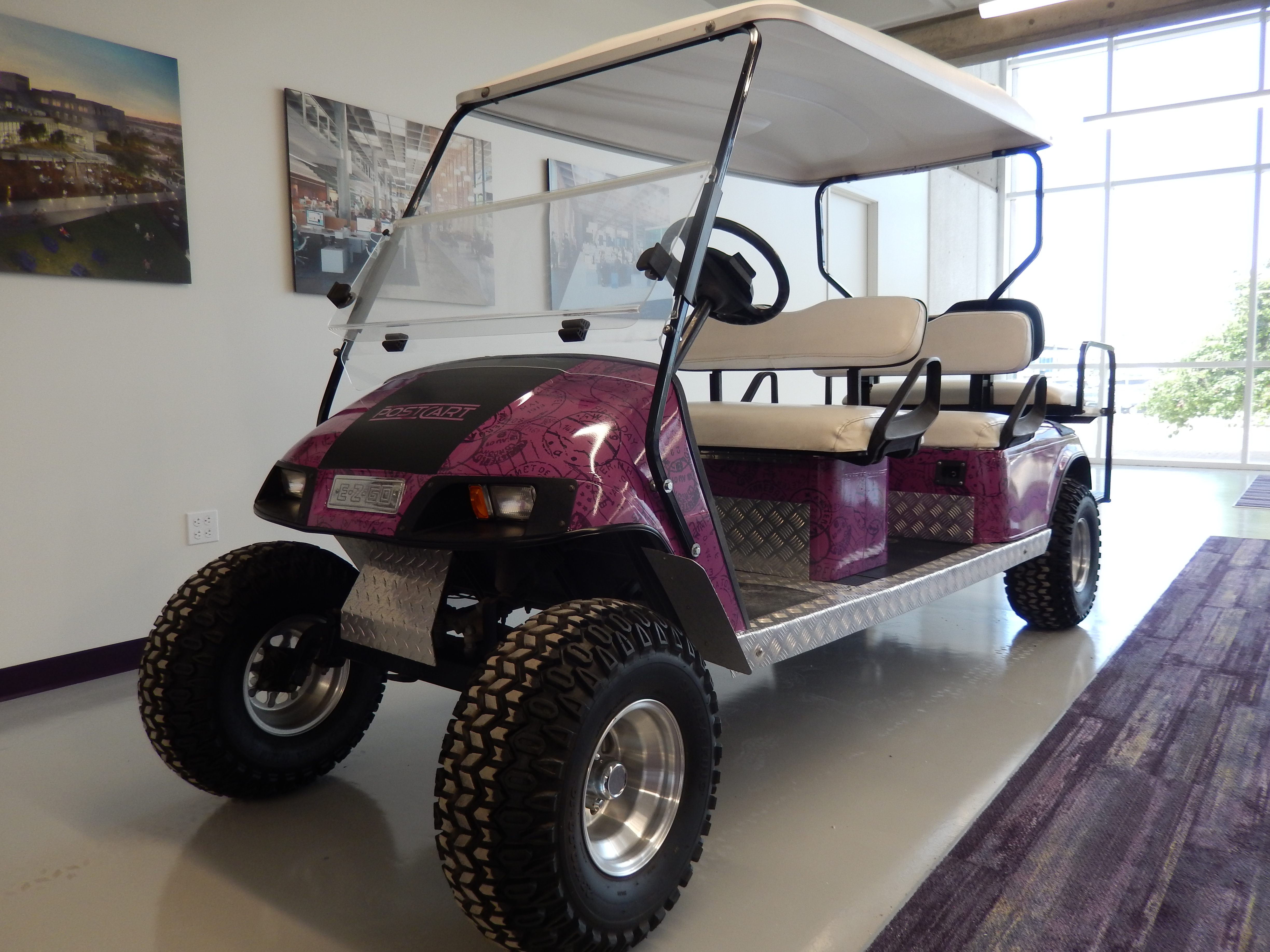
Due to the size of the development, the development will be using a golf cart to give tours of the space to potential tenants, so a graphic was created and wrapped on the golf cart. The wrapping features post marks in a random pattern and in the eye-catching color Hammer Venture chose as the theme color for the project.
Result
The right materials matched with the experience of our installation team = premium return on investment.
Client: LPA Architects (hired by Hammer Ventures)

